When we think of UX audits, most of us picture heatmaps and button placements. But one of the most overlooked killers of conversion? Confusing or off-tone copy.
You might have a beautifully designed page—but if the copy is unclear, overly technical, or sounds robotic, users will hesitate. They'll scroll. Or worse, bounce.
What Is a "Copy Clarity & Tone Check"?
At UX Scan, we believe every word on your interface should pull its weight. That's why we built a feature to automatically assess copy for two key things:
• Clarity: Is the language simple, specific, and easy to understand?
• Tone: Does it match your product's voice and audience expectations?
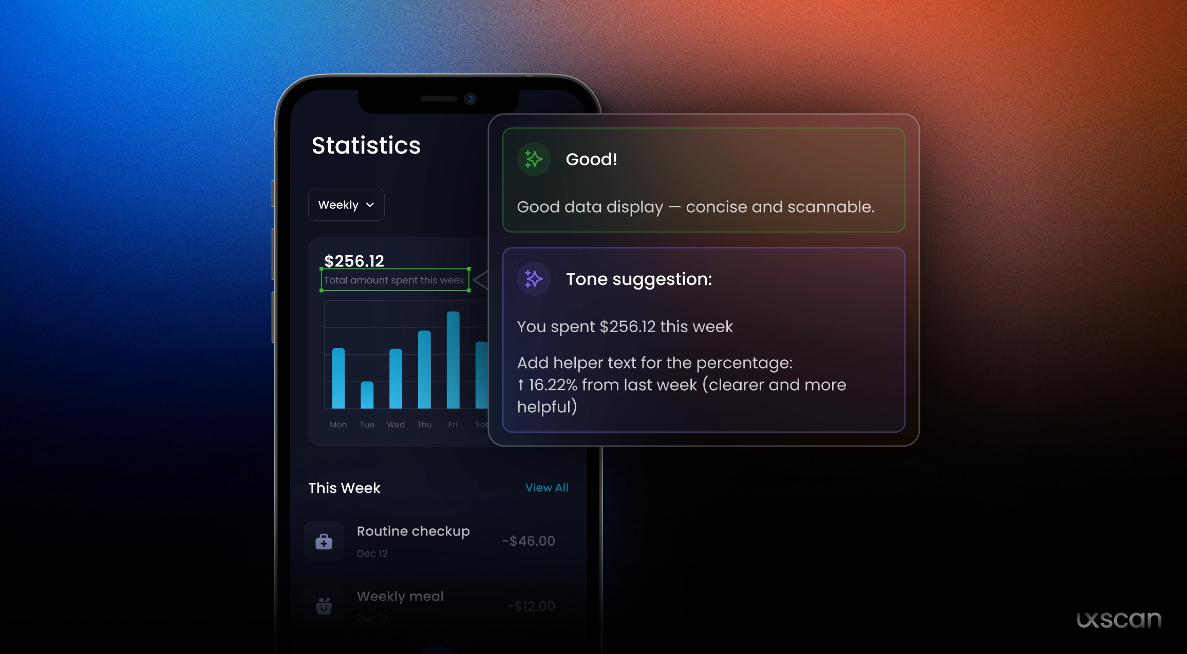
Instead of vague advice like "make it friendlier," UX Scan pinpoints which words might be too complex, where your message lacks punch, or if your CTA sounds passive.
Why Tone & Clarity Can Make or Break UX
Clarity isn't just a writing concern—it's a design one. Research shows users form impressions in milliseconds. If your microcopy is ambiguous ("Start," "Submit," "Next"), users hesitate. If your tone is too formal for a casual product (or vice versa), users feel disconnected.
Here's what poor clarity sounds like:
"Our platform delivers holistic value by streamlining integrated solutions."
…versus clearer copy:
"We help you manage tasks faster—all in one place."
Tone, meanwhile, builds trust. For a Gen Z-focused app, stiff corporate language can feel alienating. For a fintech dashboard, sounding too playful might feel risky.
What UX Scan Does Differently
With UX Scan, you don't need to second-guess every line of UI copy. Just upload your screen, and we'll:
• Highlight unclear or bloated phrases
• Flag passive or inconsistent CTAs
• Suggest clarity-focused rewrites
• Provide a tone summary (Formal? Friendly? Too neutral?)
• Offer guidance to improve alignment with your brand
No more back-and-forths with the content team late in the dev sprint. No more launching copy that "feels okay" but underperforms.
When to Use It
The Copy Clarity & Tone Check works best:
• Before final handoff to dev
• During design review sessions
• When you're reworking onboarding flows or pricing pages
• As part of an A/B test plan
It's a 60-second step that can prevent 6 months of underwhelming conversion rates.


