If you've ever watched a user struggle to find a button in your app, you know the pain of design blind spots. That's where heatmaps come in.
So, what is a heatmap?
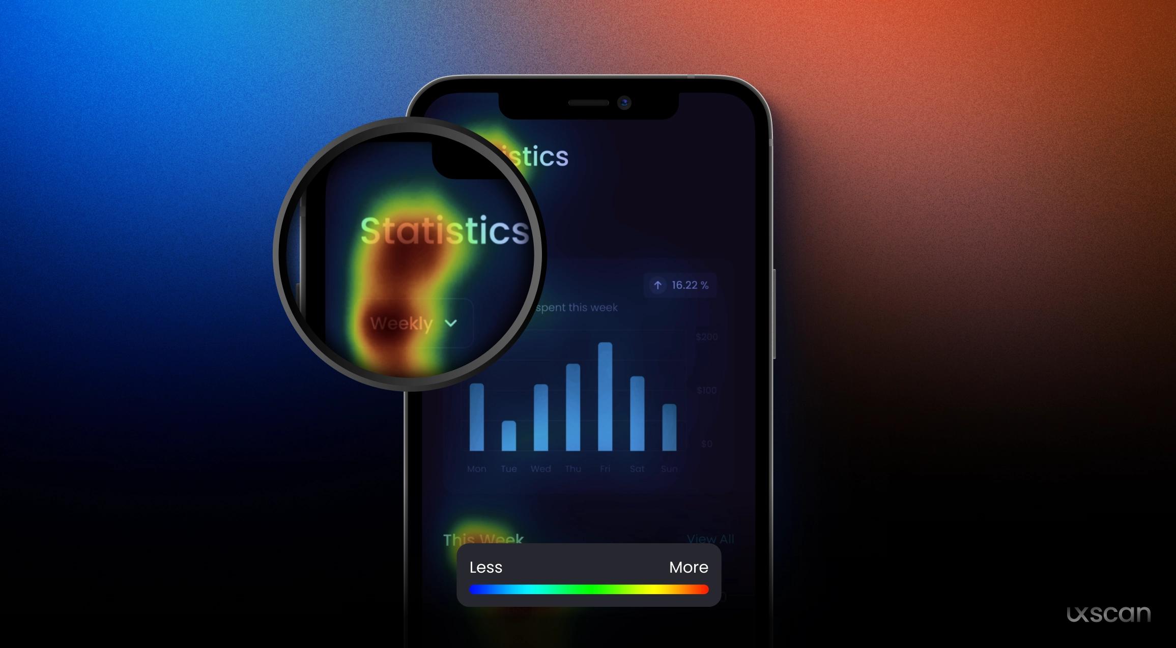
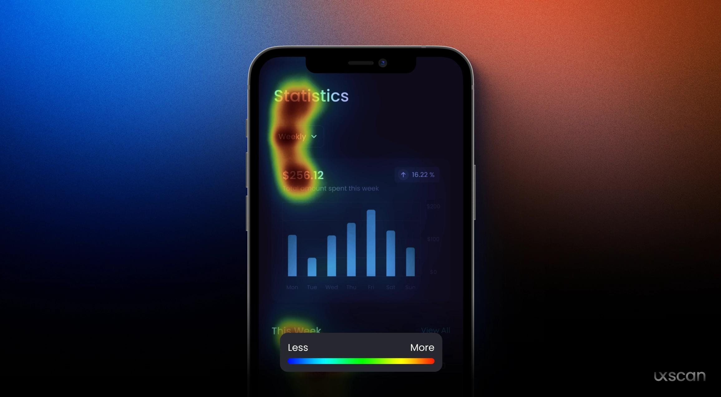
A heatmap is a visual tool that shows which parts of a screen users focus on most. Think of it as a thermal image for your design—hot zones show where people pay attention, while cooler zones reveal what gets ignored. Traditionally, teams generate these by running live user tests, capturing mouse movement or eye-tracking data.
But there's a catch: Setting up those tests takes time, real users, and a live prototype. You might not spot problems until late in the process—or worse, after launch.
Enter predictive heatmaps
Predictive heatmaps use AI to simulate human attention. Upload a screenshot or mockup, and the model forecasts which parts are likely to grab attention—without needing real users or sessions.
This isn't guesswork. These tools are based on vision science and cognitive models of how people scan a screen. The result? You get actionable insights in seconds.
Why it matters for design teams
Here's where predictive heatmaps shine:
1. Spot issues before they go live
You don't have to wait until user testing to learn that your CTA is being missed. Predictive heatmaps flag these issues early—when it's still cheap and easy to tweak.
2. Prioritize design decisions
Should that banner be bolder? Is the headline getting noticed? Heatmaps help you decide what to fix and what to leave, based on data—not opinion.
3. Speed up approvals
Ever had to justify your design to a stakeholder who prefers "more pop"? Showing a heatmap of where users will focus can end debates fast. It replaces subjective feedback with visual proof.
4. Reduce wasted dev time
It costs far more to fix a visibility issue after launch than during design. Predictive heatmaps help you avoid costly rebuilds.
Real-life example
Say your team is launching a new pricing page. You designed a beautiful layout—but the "Start Free Trial" button is buried under paragraphs of text. A predictive heatmap shows only 12% of visual attention landing on that CTA.
Now you know: it needs to move up, get more contrast, or be reworded. Better to know now than when conversions drop.
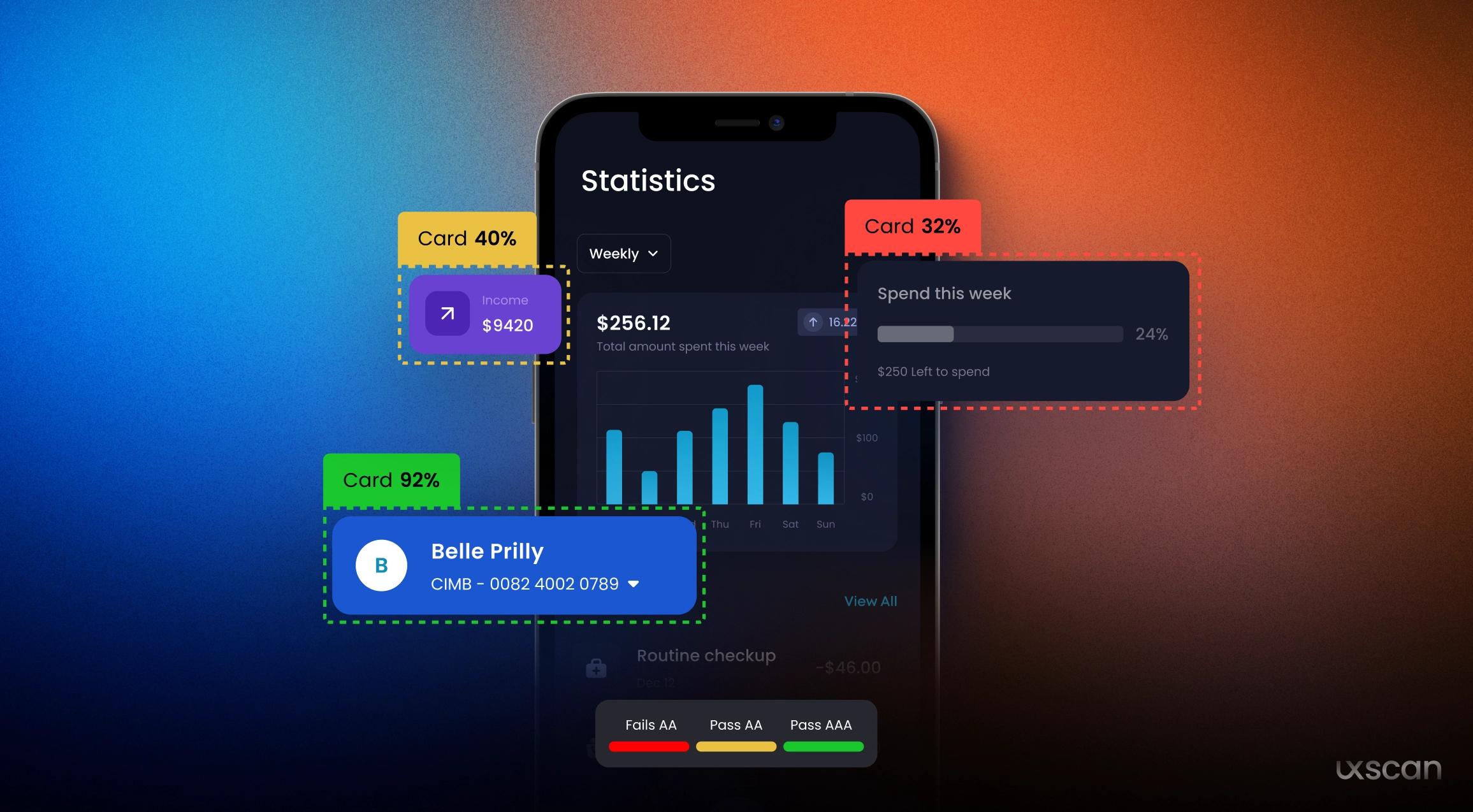
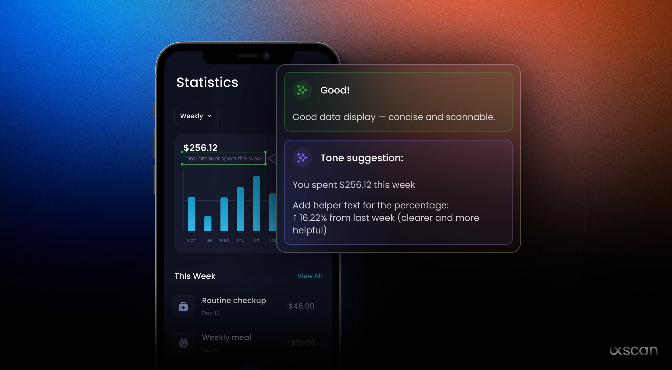
Heatmaps + UX heuristics = smarter audits
At UX Scan, we don't stop at pretty pictures. Our tool combines predictive heatmaps with heuristics, contrast scores, and clarity checks—so you not only see the problem but get fast, actionable advice to fix it.