Features
UX Scan helps you get visual clarity fast and avoid costly design mistakes. Quick, science-backed audits reveal what users actually notice — so you can fix issues before launch.
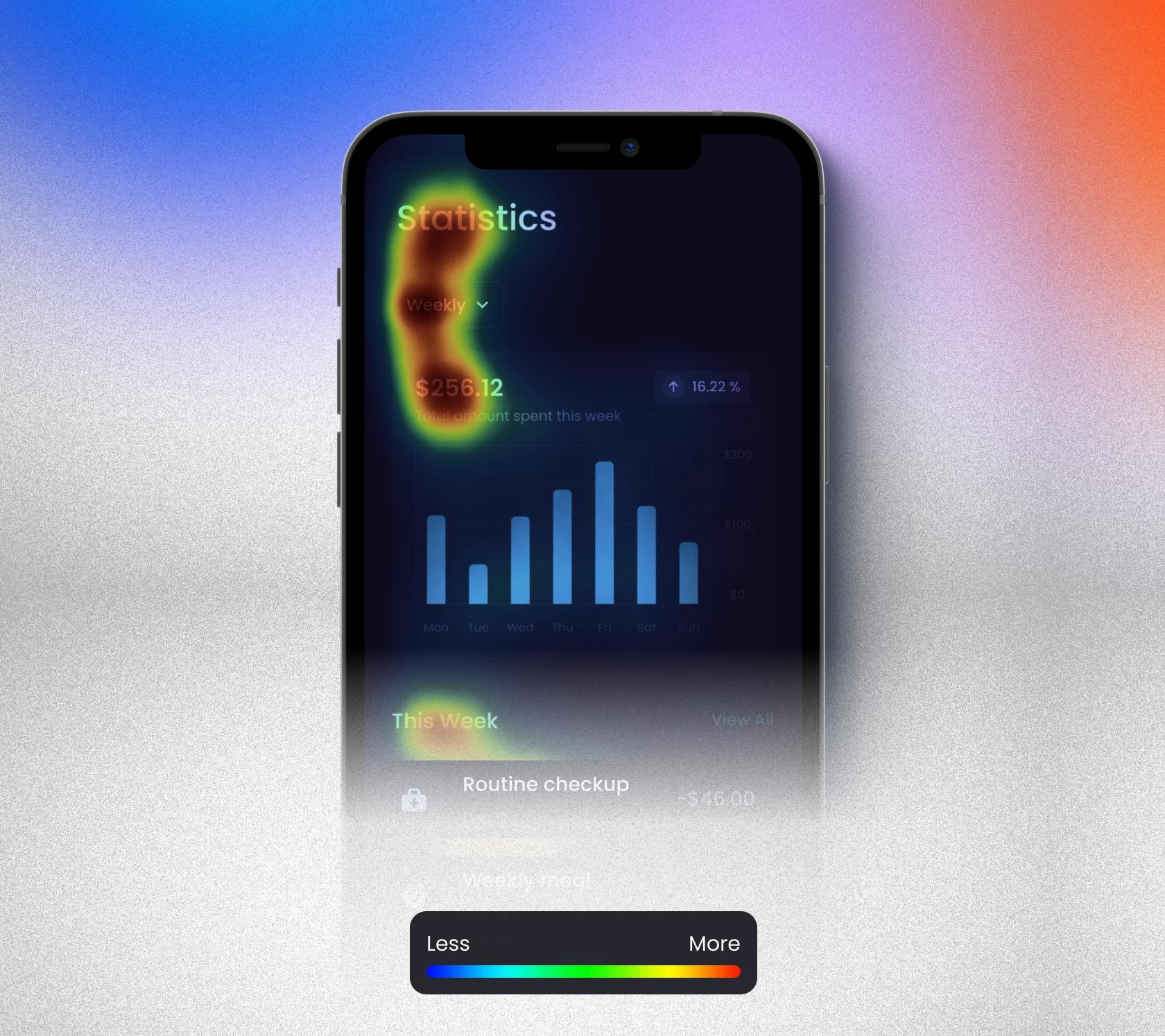
Predictive Attention Heatmap
See where users are most likely to focus — and what gets ignored. Predictive heatmaps visualize attention before launch so you know which parts of your UI draw the eye — and which go unnoticed.
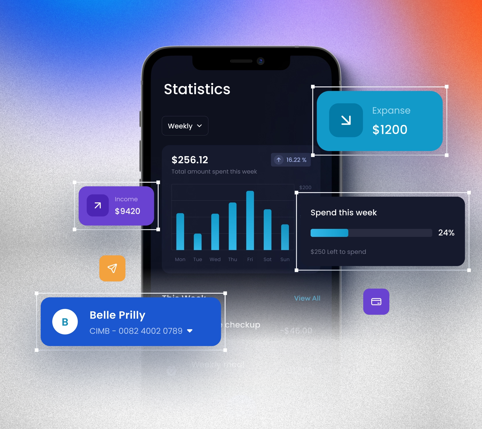
Component-Based AOIs
Not just heatmaps — we break it down per component. See exactly how much attention your CTA, navbar, or form field receives — with automatic AOI (area of interest) detection.
![[object Object]](https://res.cloudinary.com/dntladnf7/image/upload/v1751610196/feature-full-flow-audit_htc0ui.webp)
COMING SOONFull Flow Audit
Paste your URL — we'll scan the entire UX flow. From landing page to checkout, we automatically capture and audit every screen, so you can catch clarity and UX issues across the journey.
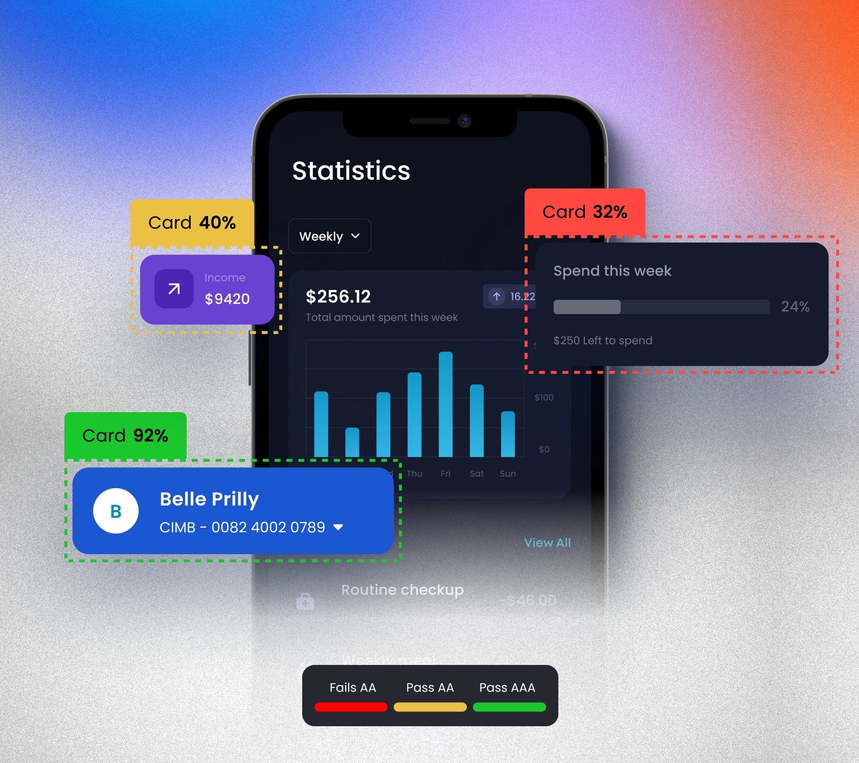
Contrast Map
Make sure every element passes accessibility — not just your layout blocks. We analyze each component (buttons, navs, text) for contrast, not just sections of the screen.
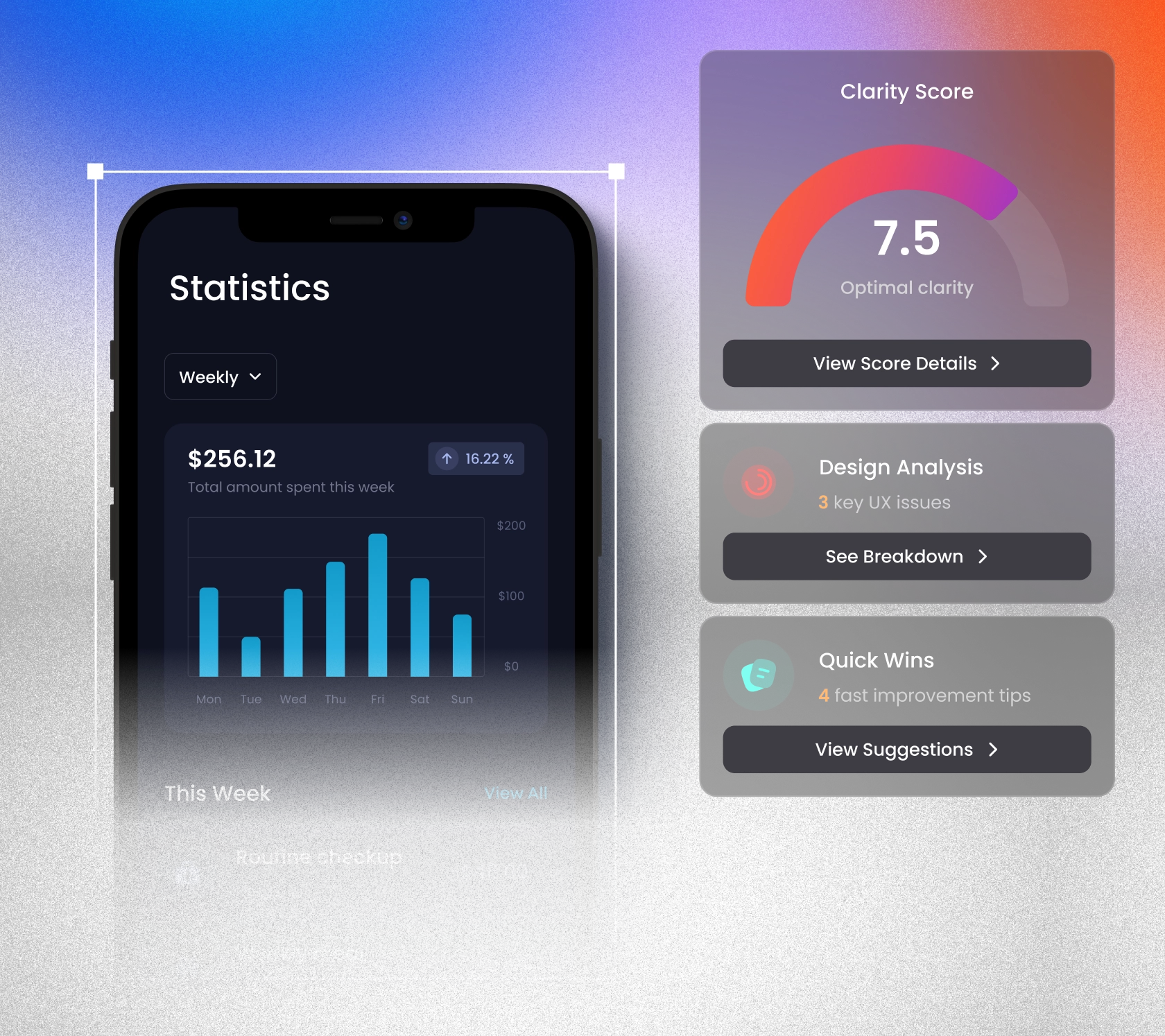
Design Insights
Get a big-picture score — with actionable next steps. See how your layout performs as a whole with an overall UX score, visual flags, and quick-win recommendations.
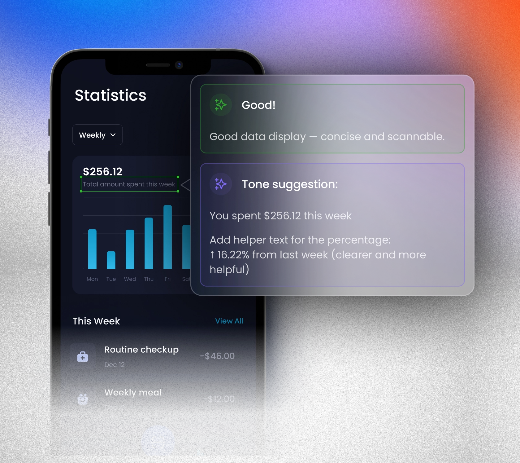
Copy Clarity & Tone Check
Design isn't just pixels — it's also words. We analyze your copy for clarity, tone, and simplicity — and suggest better alternatives if needed.
![[object Object]](https://res.cloudinary.com/dntladnf7/image/upload/v1751610199/feature-comparison_fxihot.webp)
COMING SOONDesign Comparison
A/B testing without the traffic. Upload two versions of a screen and we'll tell you which one performs better — visually and UX-wise.
![[object Object]](https://res.cloudinary.com/dntladnf7/image/upload/v1751610198/feature-multiscreen_a9j7a8.webp)
COMING SOONMultiscreen Upload Support
Audit your onboarding flow or landing journey all at once. Just upload several screens in one go — we'll analyze them individually and show how they connect.